
.png)
Along with showcasing your incredible products on your Shopify store, one of the essential parts of a successful ecommerce website are your colors and branding.
How someone recognizes your products and the overall look of your store is the equivalent of someone window shopping. A great shopping experience involves everything from how a customer shops, to how easy it is to access your products, to educating customers on who you are.
Now that you have downloaded Because, we put together this complete guide on what colors best complement each other, while still following color accessibility guidelines for an inclusive shopping experience. We also call out some core design elements we've seen in the best performing product page banners.
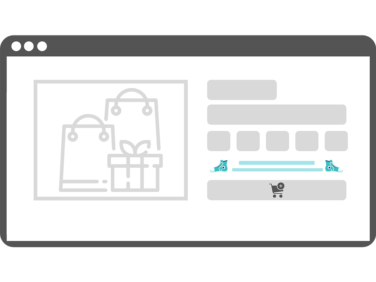
Banner Colors:
Try not to use a white background:
We strongly discourage using a white background. It puts too much strain on the site visitor's eyes and feels like your content and banner are floating around. It also can make your visitors feel like the banner content is in the way.
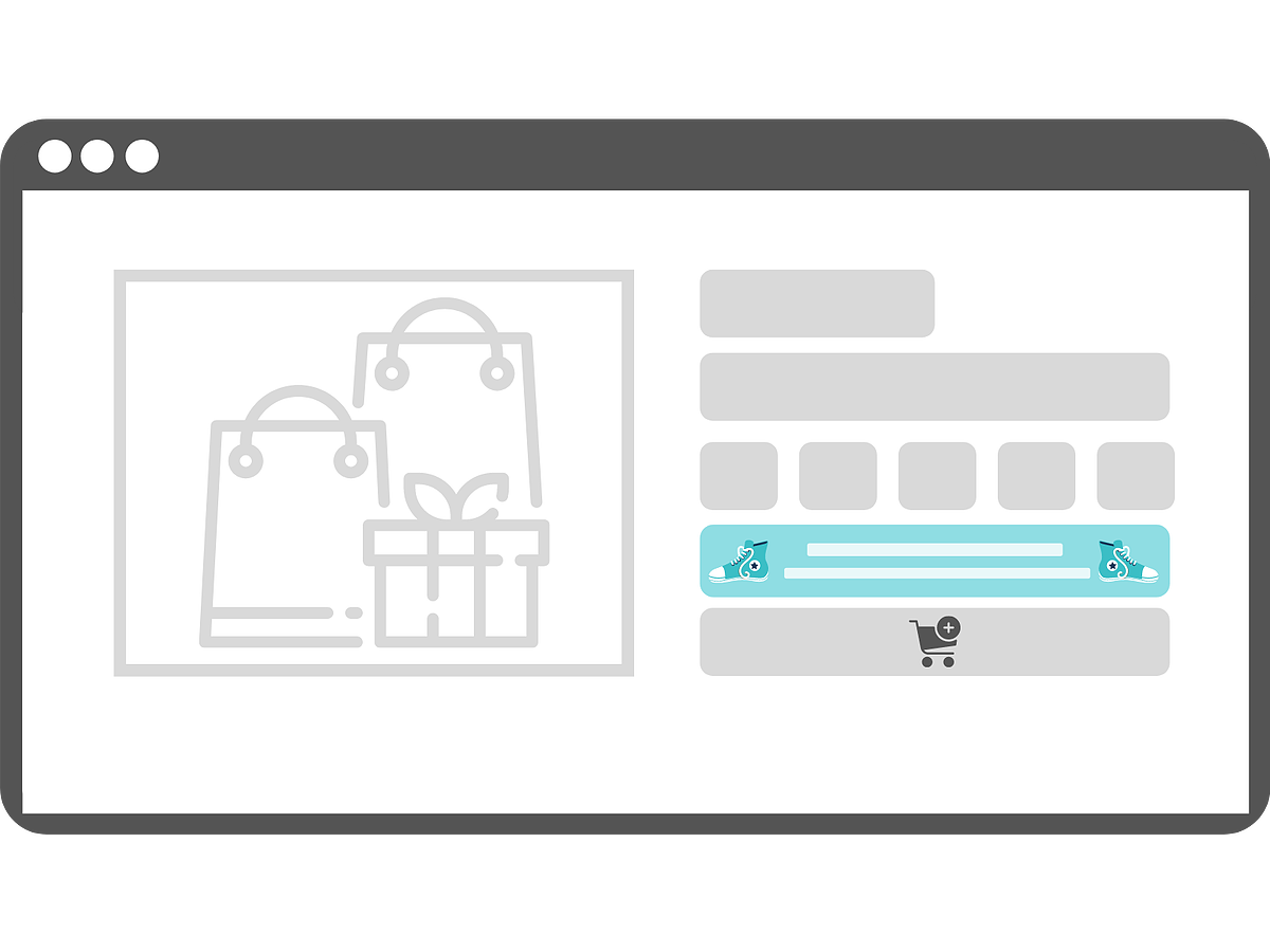
Instead, pick your "secondary color".
Because has seen success with users who pick the lightest color in their branding color palette as the background color for their banner. If you don't have a lighter color in your brand palette, or you just don't have a brand palette yet, then google the color you want, like #f0374b and then see what other colors are in that family.
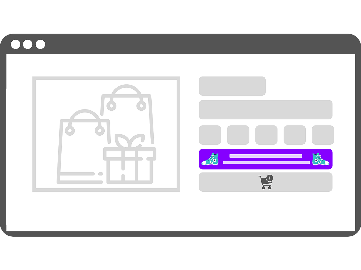
Dark color banners:
There are some sites that can pull off a dark colored banner (like black or navy blue) that look great and match your branding. If your top announcement bar and or your add to cart button are already dark colors, this may be a good option for you.
Color Accessibility:
According to In-Vision, color accessibility “enables people with visual impairments or color vision deficiencies to interact with digital experiences in the same way as their non-visually-impaired counterparts.” It’s estimated that roughly 217 million people live with some form of moderate to severe vision impairment, chances are they are in our communities shopping just like you and I.
Designing your Because banner with color accessibility in mind is simple and can be a great guide to design for the inclusivity of your site visitors. Plus, it just ensures your banner looks good :)
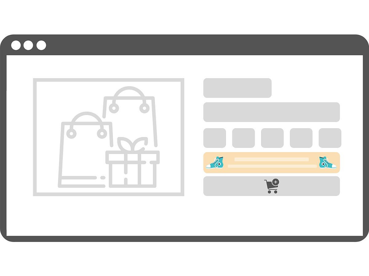
Plain and simple, don't put colors on top of other colors that make it hard to read or see. Like white on beige, grey on black, or a bright color on top of another bright color. We linked the official guidelines for this here.
- Ensure there is enough contrast between your text and background
- Choose colors that complement each other
- Focus on having a color palette that has your main and secondary color choices
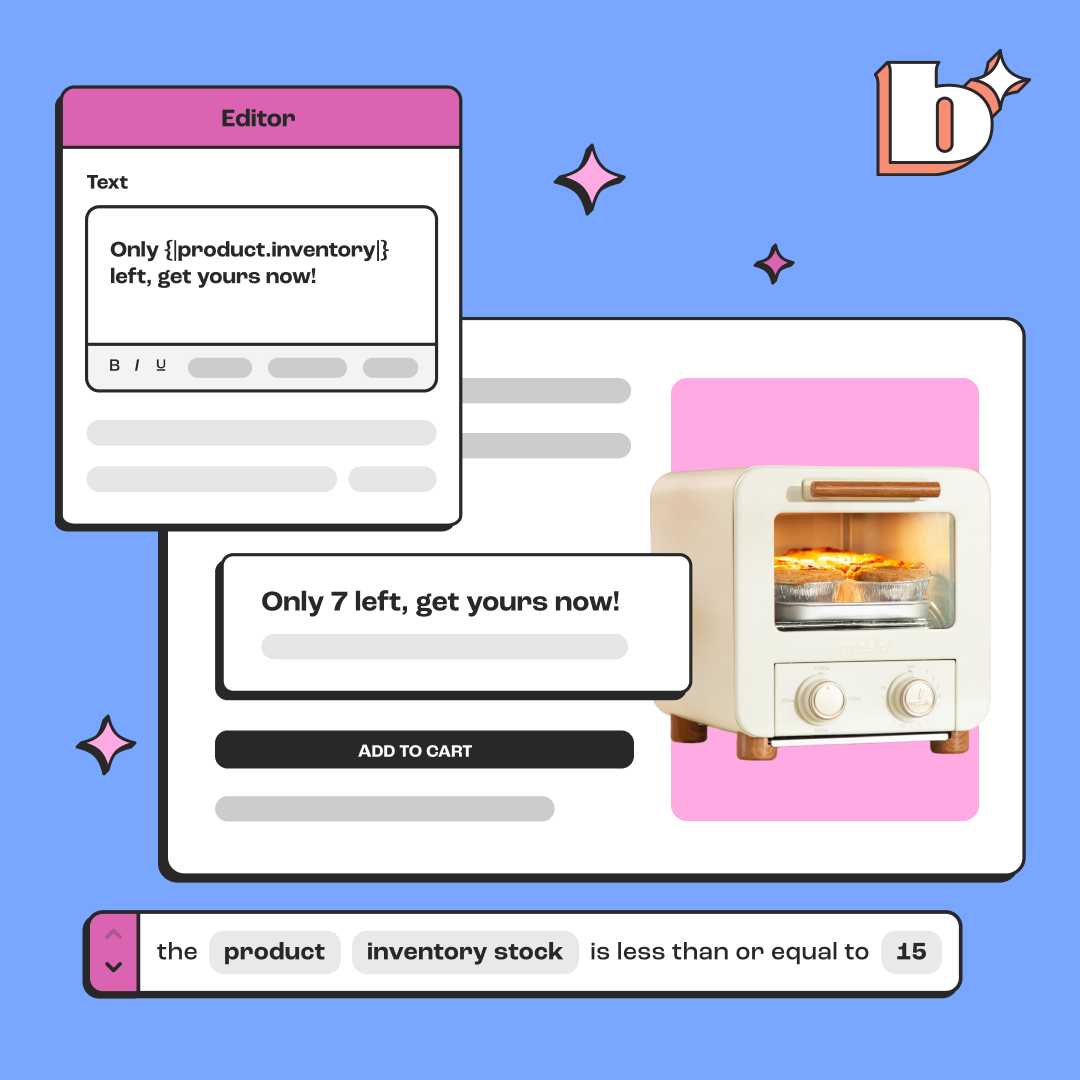
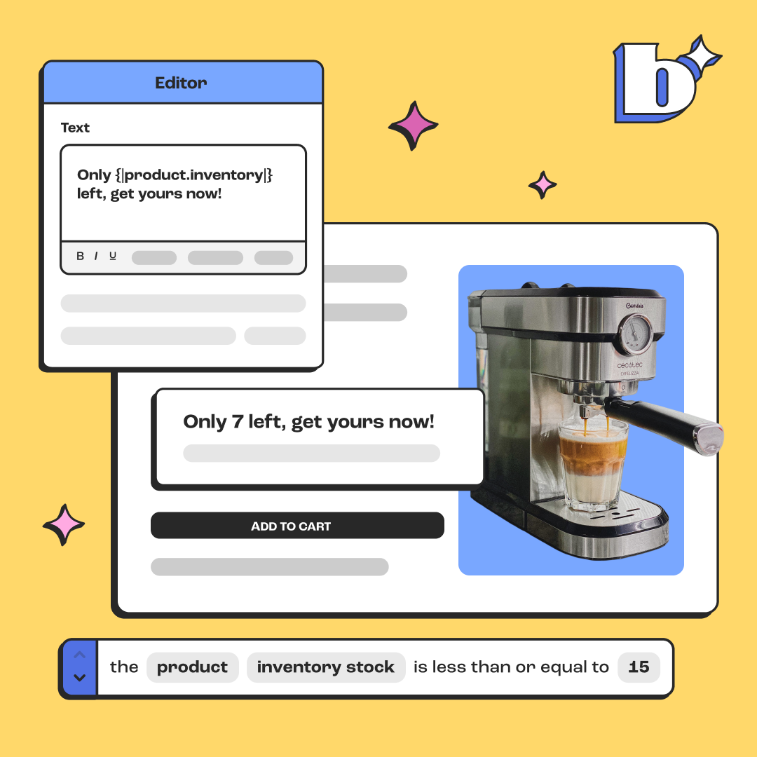
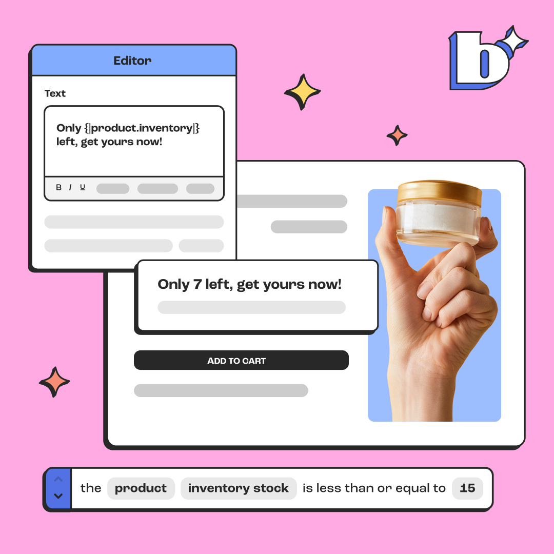
Here are some great examples of Because product page banners that feature secondary colors are simple to read, and compliment the overall brand of the Shopify site.
-1.png)
.png)
-1.png)
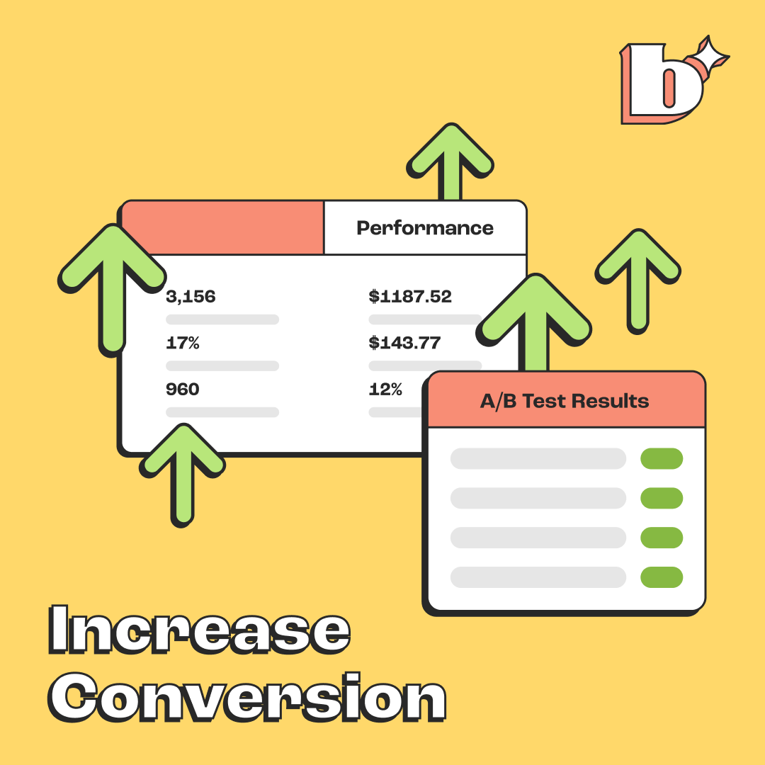
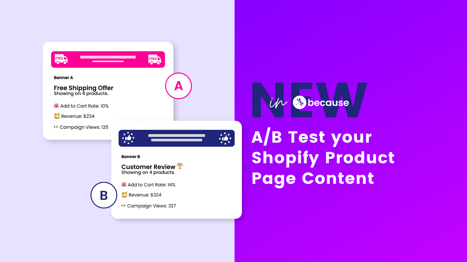
Ready to take your product pages to the next level and increase conversion with product banners?
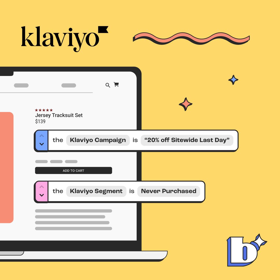
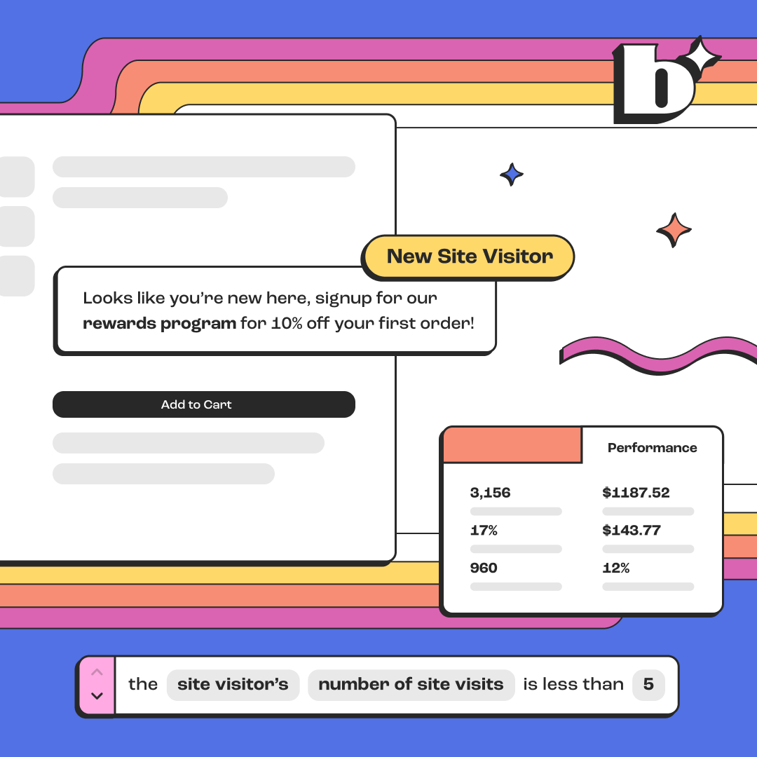
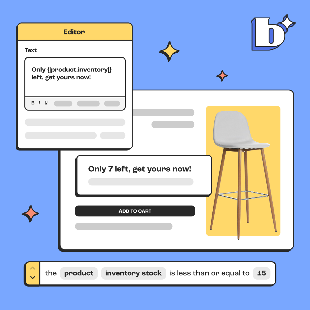
Create in the NEW Rules Engine. Get started on adding your Banners, Pop Ups and Top Bars to your Shopify site by automating your content, so it shows up at the right time, to the right customer. Be sure to read up on the full guide and FAQ to the Rules Engine in our previous blog post.


.png)
.png)

.png)
.jpeg)
.jpeg)
.jpeg)
.jpeg)
%20(1).png)
.webp)


