
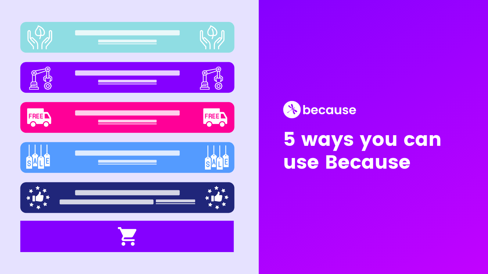
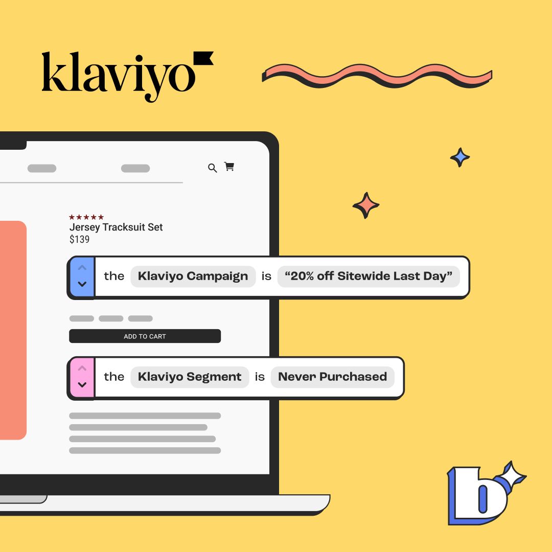
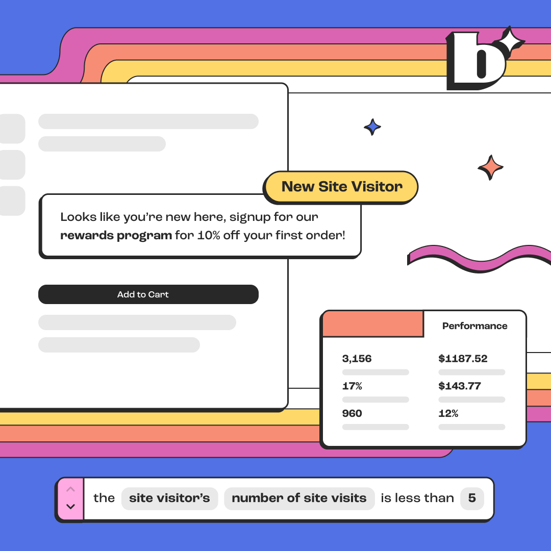
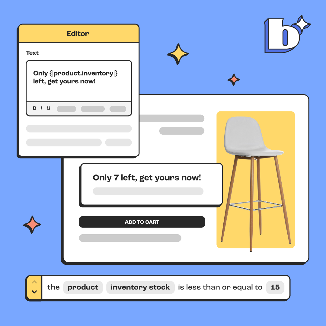
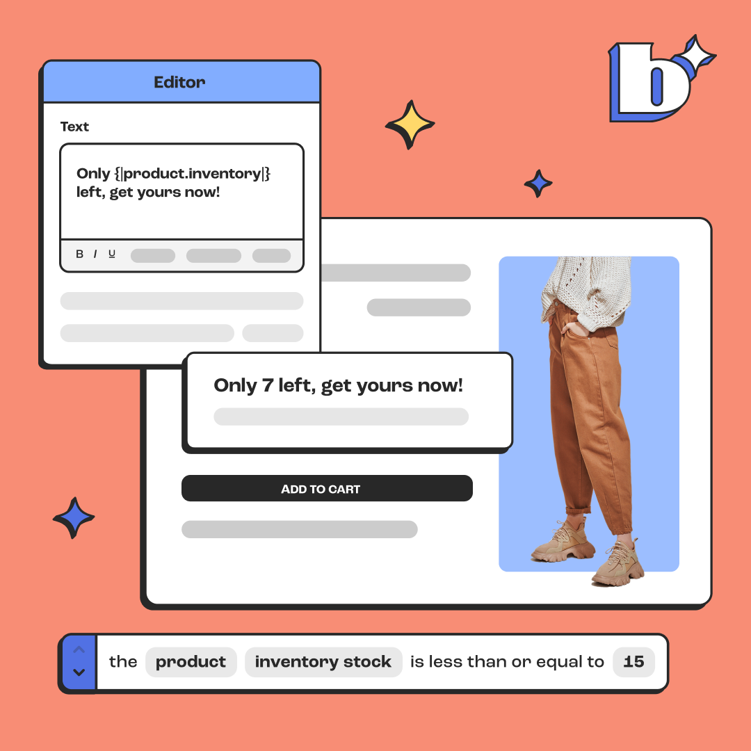
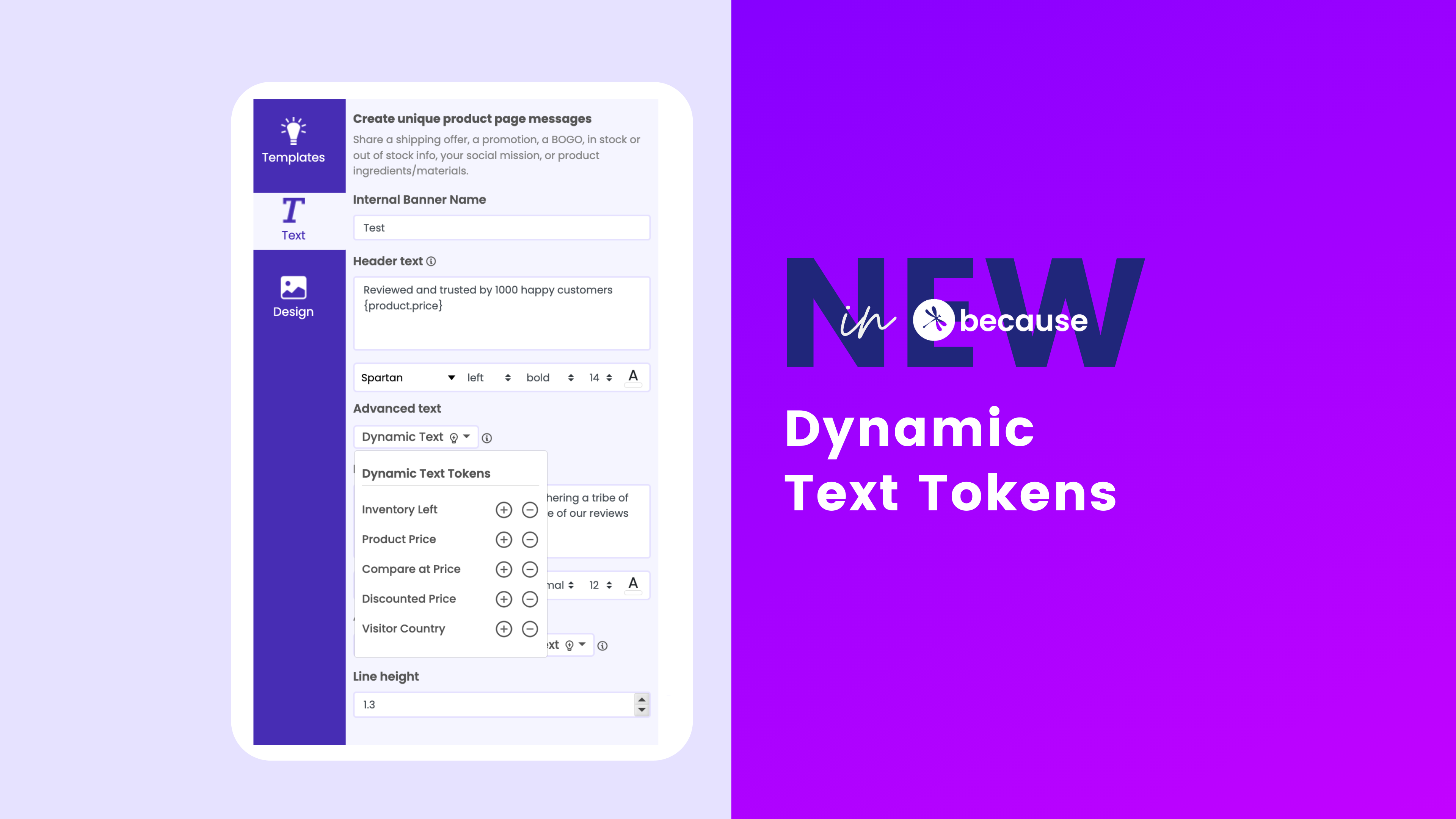
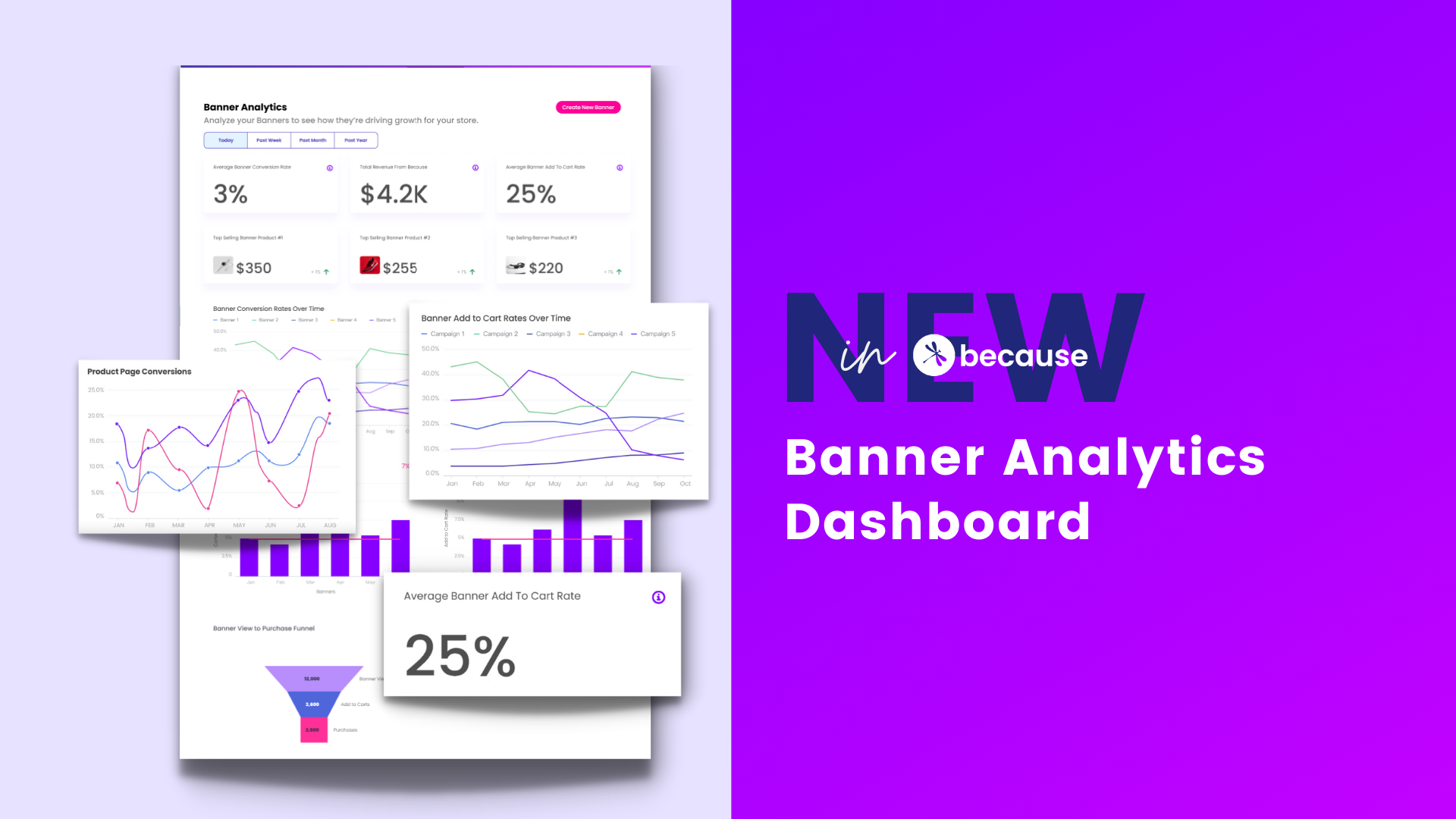
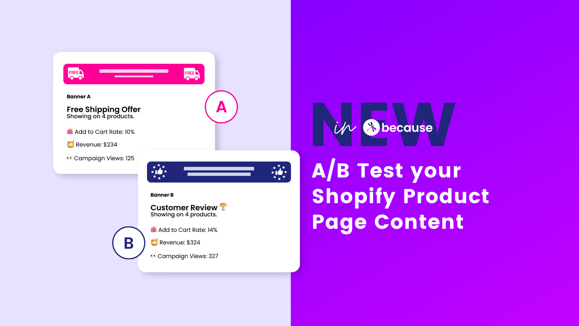
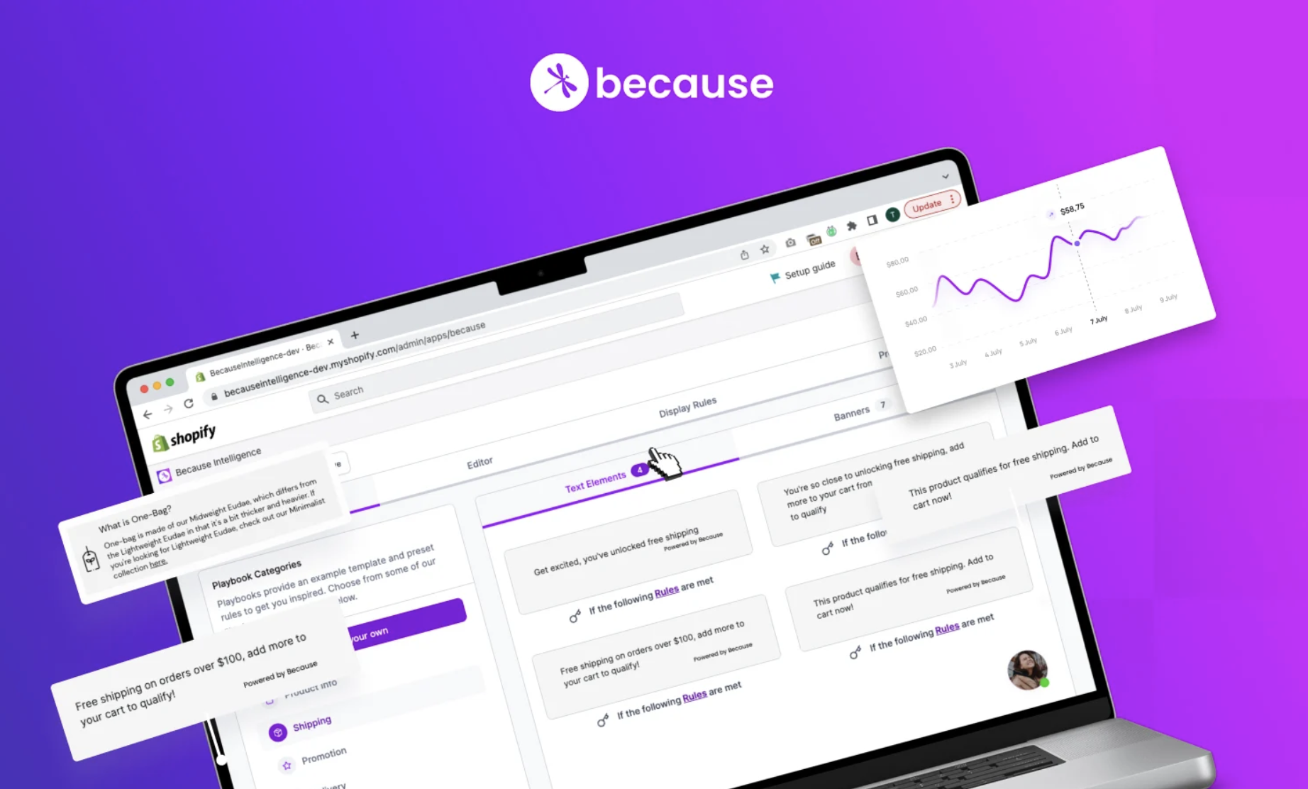
Now with Because banners, you can add different banners on every page, all 100% customized to your message and brand look. You can further automate this in the new Rules Engine, to decide when and where your banners appear.
But even with all that capability, a lot of people get hung up on what message to share and where. So here's our new blog covering "5 ideas to convert site visitors on your product page."
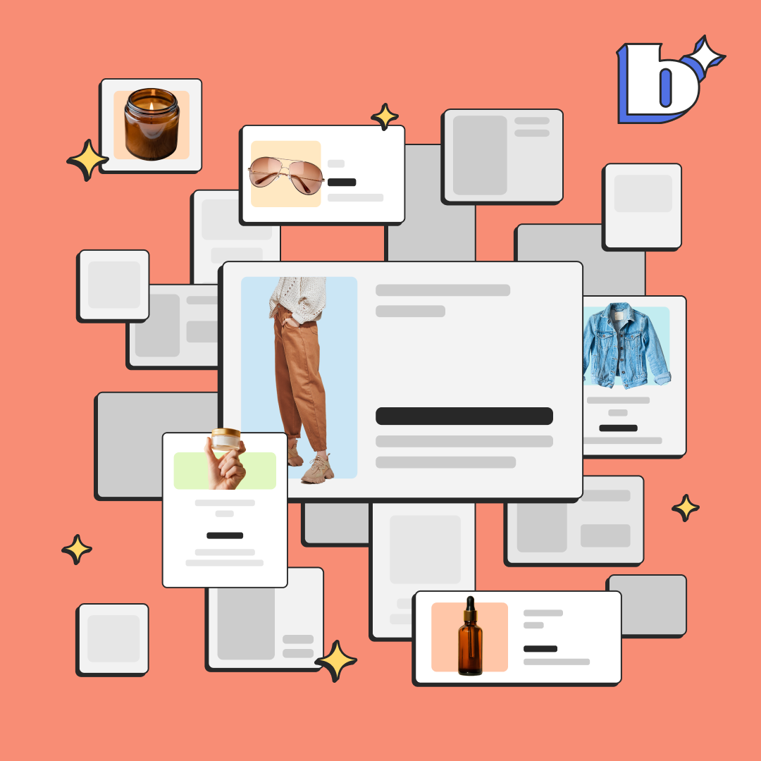
Different messaging to try on your product page
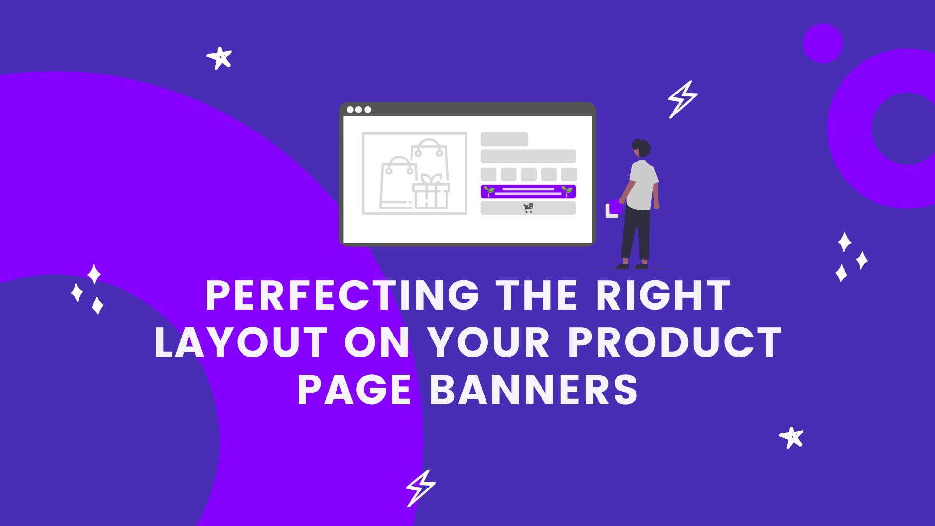
In this blog, we'll cover a few different options on messaging you can try above your add to cart button to capture your customer's attention and get them to convert.
1. Customer Reviews
2. Shipping Information
3. Promotions/Discounts
4. Product Ingredients/Materials
5. Company Mission/Give Back

1. Let's start with 'customer reviews'
What better way to demonstrate the value of your product than in your customers' words? Customer reviews and testimonials can be powerful tools to drive site conversion, but they're often hidden all the way at the bottom of the product page with unflattering formatting, like this:

Instead of hiding all your awesome reviews at the bottom of the page, pull up your most impactful one for each product and feature it in a Because banner above your add to cart button. Match every tiny detail of your branding from font to color to icon imagery, rather than the pre-set formats most review apps give you.
The best part is: you can switch it out for a new one on every product the second new reviews coming rolling in!

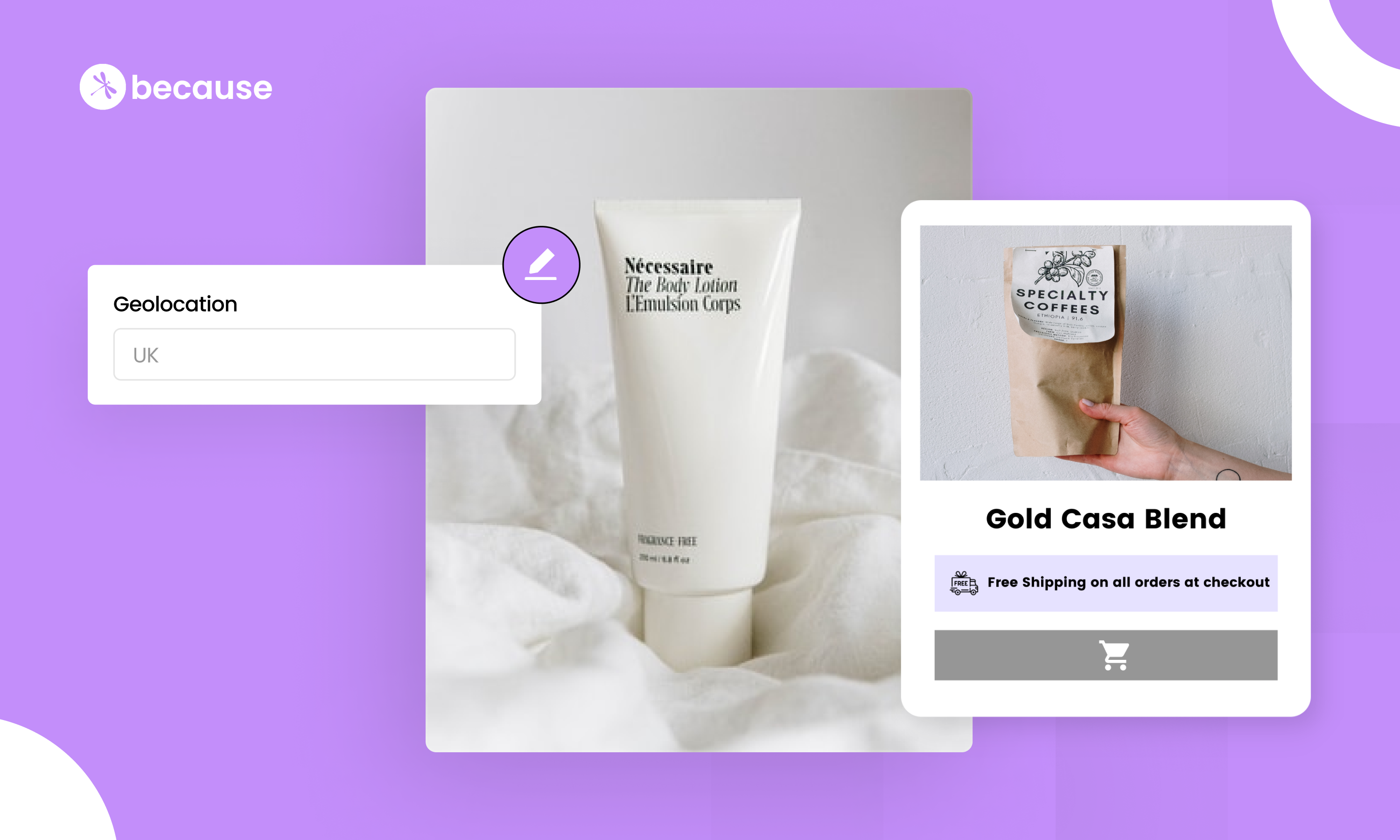
2. 'Shipping information' they can't miss
One of the most important messages on a site for many customers who want fast and cheap (or free) shipping, but so often displayed in one of the most boring, unexciting ways! This look familiar?

Try calling out your shipping in a Because banner right above the add to cart button instead. The best part is you can get super custom with the message across products, like this one shipping from the LA office.

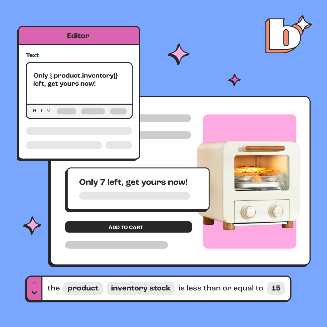
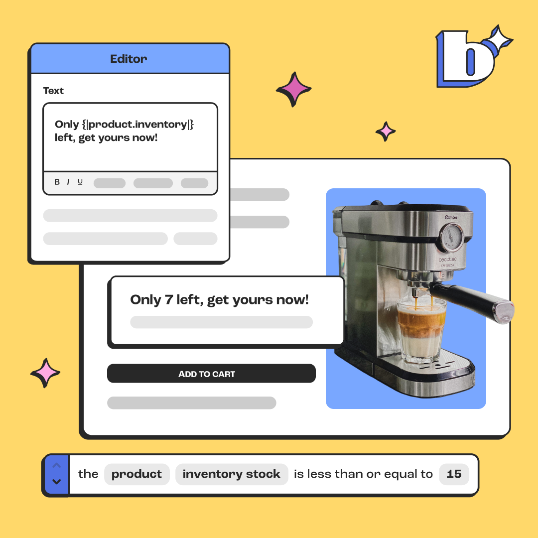
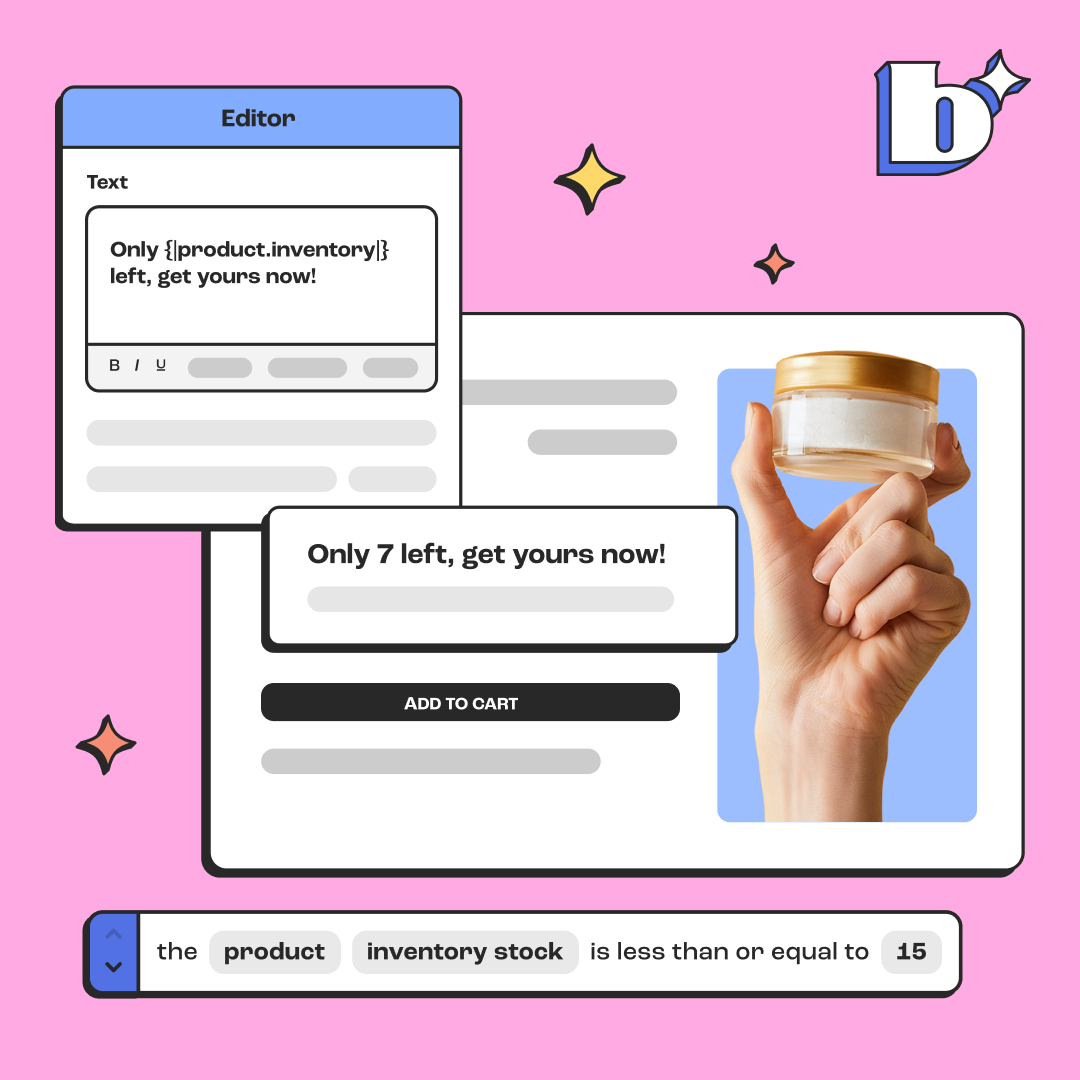
3. A new way to share 'promotions & discounts'
Your typical approach to sharing promotions and discounts probably looks something like this:

Easy to miss and static across all your product pages.
Rather than your typical way of sharing promotions and discounts in your top announcement bar, try sharing that same information above your add to cart buttons.
Try calling it out in a way that feels more personal with extra copy. Maybe even create promotions that are specific to certain products now that you have the flexibility to share a different message on each product!

4. Highlight your 'product ingredients or materials'
Are you hiding all your awesome product materials and ingredients in expandable menus in your product description like the below? Or even worse, in lengthy copy underneath your add to cart button? It's time we reinvented how we share product information.

From how your product was handcrafted, to the love and care that goes into your packaging, to all the good stuff you put in your ingredients to drive XYZ health benefits. This is all powerful storytelling that can help your customer make that final decision to click add to cart and purchase.
So why not feature it in a place they'll actually pay attention?

Grab just the most important parts, call them out in little digestible tid-bits in a Because banner. You may even choose to add multiple banners stacked on top of each other here to list different ingredients or materials you product is made of.

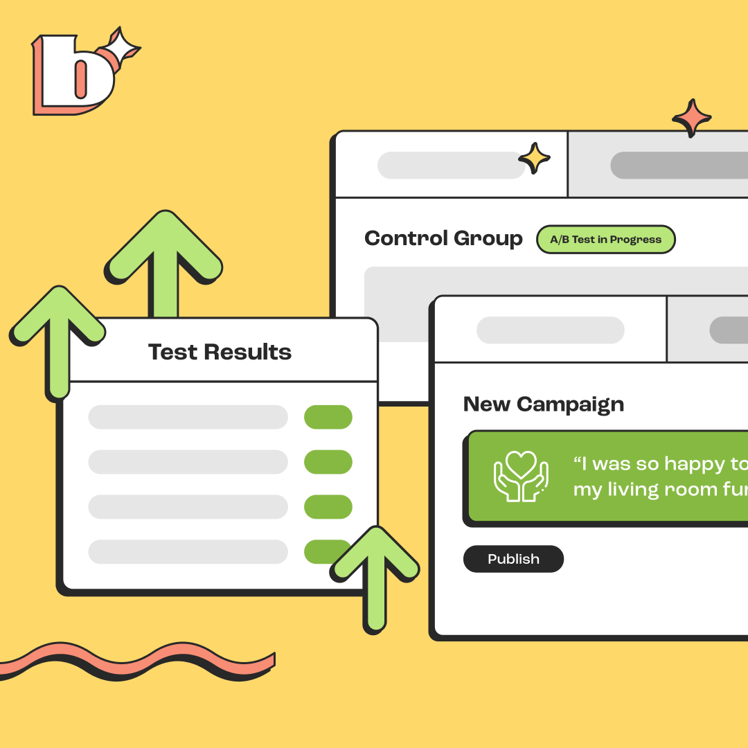
5. Call out your 'company mission or give back'
Let me guess- you share your company mission on a little page on the back of your site called "About Us" or "Our Story" like below. Even though the story there might be awesome, the majority of your site visitors likely aren't reading it. It's too long for their 8 second attention span!

Here are two examples of a better way to share a little nugget of that information in a fashion that's much more impactful to short attention span site visitors:


.png)
.png)
.png)
.png)
.jpeg)
.jpeg)
.jpeg)
.jpeg)
%20(1).png)
.webp)


